
ILShakeFest font
The Illinois Shakespeare FestivalTTF (31.6Kb)
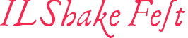
ILShakeFest font Copyright 1995 Illinois Shakespeare Festival --------------- The idea of a Folio Font: This font is based on the First Folio of Shakespeare. It was designed primarily from the main titles (there are several distinct differences between titles, text, quotes, character names, etc.). It's a specialized font for specific uses, but I think you'll find it enjoyable to have available, particularly for creating the correct "feel" in an instantly recognizable way for marketing materials for Shakespeare plays or other items relating to the period. The main structure of this font will work best for limited use (it's great for display work, like the titles of the plays). In order to have a font that had some additional value, however, we added some characters to aid in its use for text. Because it was expected that the use would be mostly for titles, it has a more oblique feel than most of the text in the folio and the caps are a little fancy for straight text use (but close to the italics used for songs or character names). It _does_ have enough available to work with some body text. Keep in mind that you have to know how the letters are used in order to make this font work properly. It would be totally impractical to take a manuscript and just select all and switch to ILShakeFest font (yes, that's the name of it). The main problem you would have would be in the usage of the letter "s" which should have an entirely different look based on the position within the word, etc. Scott Mann (a student at Illinois State University) did all the heavy lifting on this font and created the bulk of it, while I added ligatures, alternate characters, and some refinements. This should be considered a first version. With your feedback, we will attempt to fine-tune and add for future releases. Are there additional ligatures which would be useful? Should we have a second, non-oblique font that would be used for straight text? Are there other punctuation marks or symbols that are needed? Please let us know. This font is Freeware. The Illinois Shakespeare Festival retains the rights to the font, but you may distribute and use it freely as long as it is not sold or altered and this "read me" file is included. Why the name "ILShakeFest"? Wouldn't "FolioFont" or "Shakespeare" have been more appropriate? Probably. But that's what you pay for a free font. We get a little publicity. Fair trade? The font contains all upper and lower case letters, plus period, comma, colon, semi-colon, question-mark, parentheses, slash, hyphen and certain special characters. There are some special characters that I tried to place in easy-to-remember locations for key strokes, as follows: Three variations of the letter "s" for lower-case use 1. The "s" that looks like a long flourish is the standard lc "s" 2. The "s" that looks like an "s" is "option-s" 3. The "s" that looks like an "f" that extends over the next letter is "Shift-option-s". This works particularly well when followed by "t" or "i". However, the "h" is too tall to work with that, so: The "sh" that looks like "fh" is "option-h" The "ct" with the little connecting flourish is "option-c" There is also a alternate capital "A" with a leading flourish that is "option-a" _____The use of the letter "s"______ This is a quick cheat, not meant to be authoritative (I haven't studied this), but to allow for a close approximation. No need to worry about upper case. For an "s" at the end of a word, use #2, above (this includes instances before an apostrophe, such as "is't". For almost any other "s", use #1 if it's Title or italics, and use #3 if it's straight text. The exception seems to be with the double-ess. From my quick glance, I think if in title or italics, use "1,2" and if straight text, use "3,3" So, it is possible to take a document, change the font to "ILShakeFest" and then use your word processor's search and replace function to: 1. Change all the "s" in the body text of the document from "s" to "Shift-option-s", and then 2. Change all instances of "s space" and "s apostrophe" to "option-s space" and "option-s apostrophe" respectively. That should get you close. A note about font types: In both the Macintosh and Windows version, both Type 1 and Truetype versions are included. Which to use? If you are primarily printing to a non-postscript printer (ink-jets, etc.) and don't have ATM (Adobe Type Manager), you'll probably be happier with the Truetype. If you're planning on doing any desk-top publishing and sending projects in electronic form to be printed by a professional printer, you should throw out all your Truetype fonts and try to only use Type 1 or 3 fonts, because the high-end output for print houses really doesn't like Truetype. (I'm sure of this on Macintosh because I do a lot of DTP, but I'm not as confident of this information for Windows, 'cause I don't do windows.) I'd love to hear your feedback, comments and suggestions. Write to me at: [email protected] --Peter Guither, General Manager The Illinois Shakespeare Festival ------------------------------------------------ Come visit the Festival! Professional summer theatre in an open-air Elizabethan theatre on the beautiful grounds of Ewing Manor in Bloomington, Illinois. Green show, museum exhibit, free concerts and much more. Hotel packages available. ****The 1996 Season***** "Twelfth Night" "The Tempest" "The Triumph of Love" by Pierre Carlet de Chamblain de Marivaux June 20 - August 10. THE ILLINOIS SHAKESPEARE FESTIVAL Campus Box 5700 Normal, IL 61790-5700 Tickets: (309) 438-2535 Management Office: (309) 438-7314 [email protected] http://orathost.cfa.ilstu.edu/isf.html
CHARACTER MAP [78]
300x250
HASH TAG
- ttf
- fancy
- daniel zadorozny
- sans serif
- script
- regular
- techno
- specific
- handwritten
- italic
- various
- basic
- bold
- dingbats
- decorative
- serif
- hand
- otf
- iconian s
- sans
- old
- tech
- outline
- iconian
- sci fi
- condensed
- copyright
- modern
- cartoon
- written
- comic
- foreign
- farsi
- bat
- distorted
- ding
- signs
- line
- light
- chalk crayon
- dingbat
- gothic
- retro
- handwriting
- windows
- art
- pixel
- eroded
- man
- black
- deco
- type
- sign
- pixel / bitmap
- neale davidson
- writing
- out
- condense
- dense
- com
- expanded
- ray larabie
- s online
- manfred klein
- decorat
- decorativ
- que
- standard
- display
- sans s
- sans se
- ode
- thin
- square
- shadow
- red
- design
- icon
- ssi
- medium
- More...